Browse articles
Tag: chrome logo
Case Studies


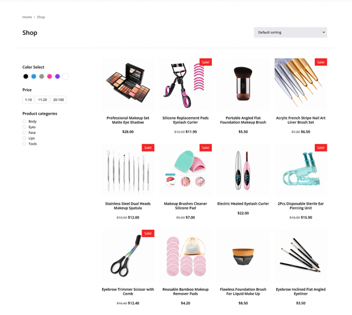
Beauty & Makeup Shop
A clothing brand wanted to launch a new e-commerce website that would allow customers to browse and purchase their products online. We developed a...


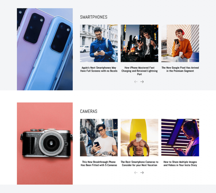
Tech & Gadgets Shop
A clothing brand wanted to launch a new e-commerce website that would allow customers to browse and purchase their products online. We developed a...


Personal Trainer Shop
A clothing brand wanted to launch a new e-commerce website that would allow customers to browse and purchase their products online. We developed a...

